Designing the aha moment & increasing
activation by 27%
MRR ↑
27%
4,6
Context & Problem
Potis.ai is an AI startup that helps companies run more structured and fair candidate interviews. When I joined as the Founding Product Designer, the product was already gaining traction,
but there was a critical funnel issue: many users signed up but dropped off before reaching the core value.
Business Requirements
These problems mapped directly to what the business needed:
Increase adoption and engagement
Improve time-to-market
Strengthen positioning for investors
Establish a cohesive experience across the website, registration fand dashboard
Make the look and feel competitive with the top players in the market

Research
To understand why users were dropping off, I combined qualitative research with behavioral data.
Key insight: users couldn't see what to do on the dashboard, or why the product was worth their time.


Hypothesis
Research showed that users left because they couldn't see the payoff before the work.
Redesign, not small fixes
Design Principles
These principles guided the redesign and helped users reach value faster.
Deliver value before asking for effort
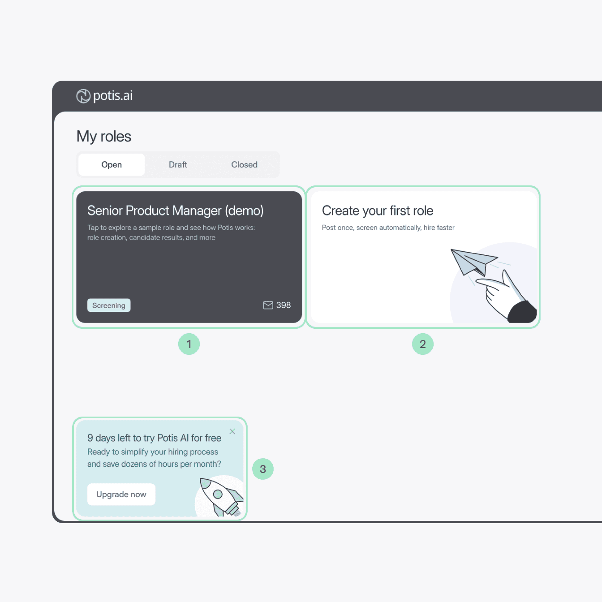
Users can explore a demo role and see candidate results before creating their own role, reducing upfront effort and accelerating time-to-value
Before
After
Before
After
Guided onboarding that keeps users oriented
The onboarding flow is designed to continuously orient users and guide them toward their first meaningful result, reducing uncertainty and helping them maintain momentum throughout the setup process.
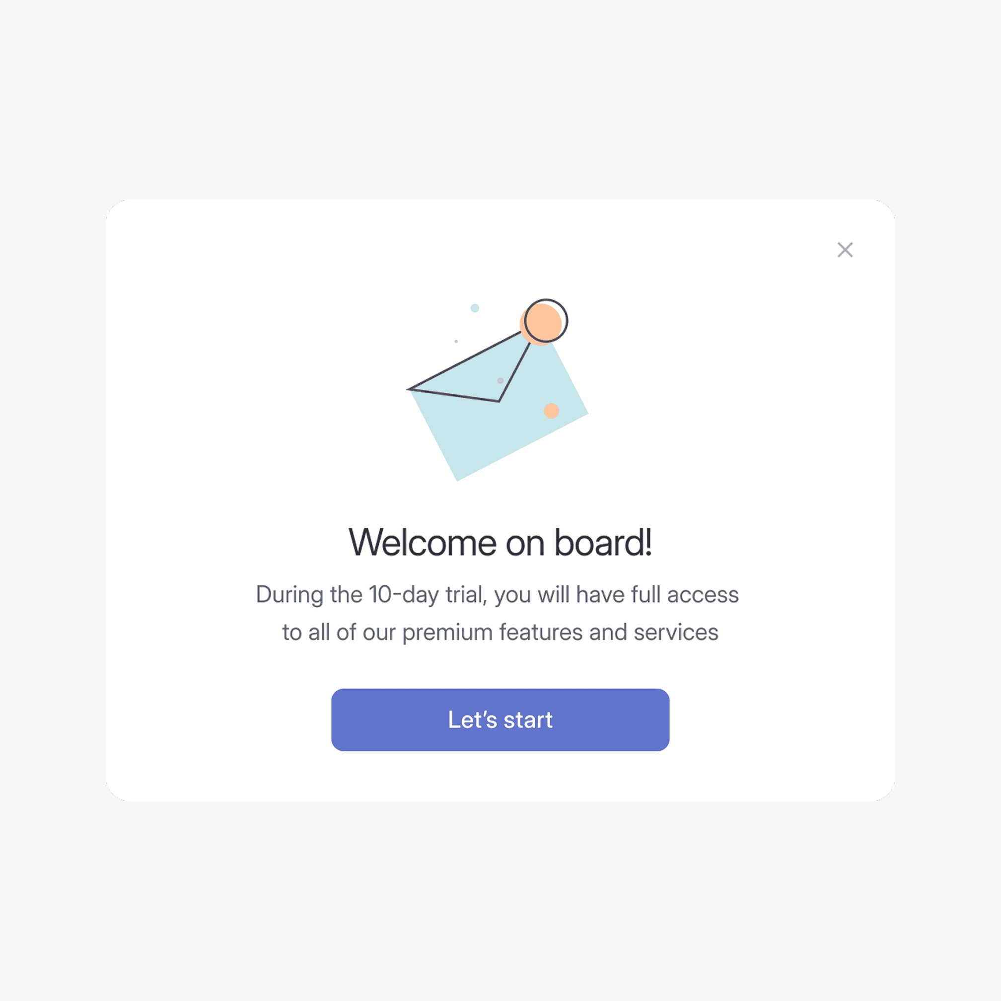
A first screen after sign-up
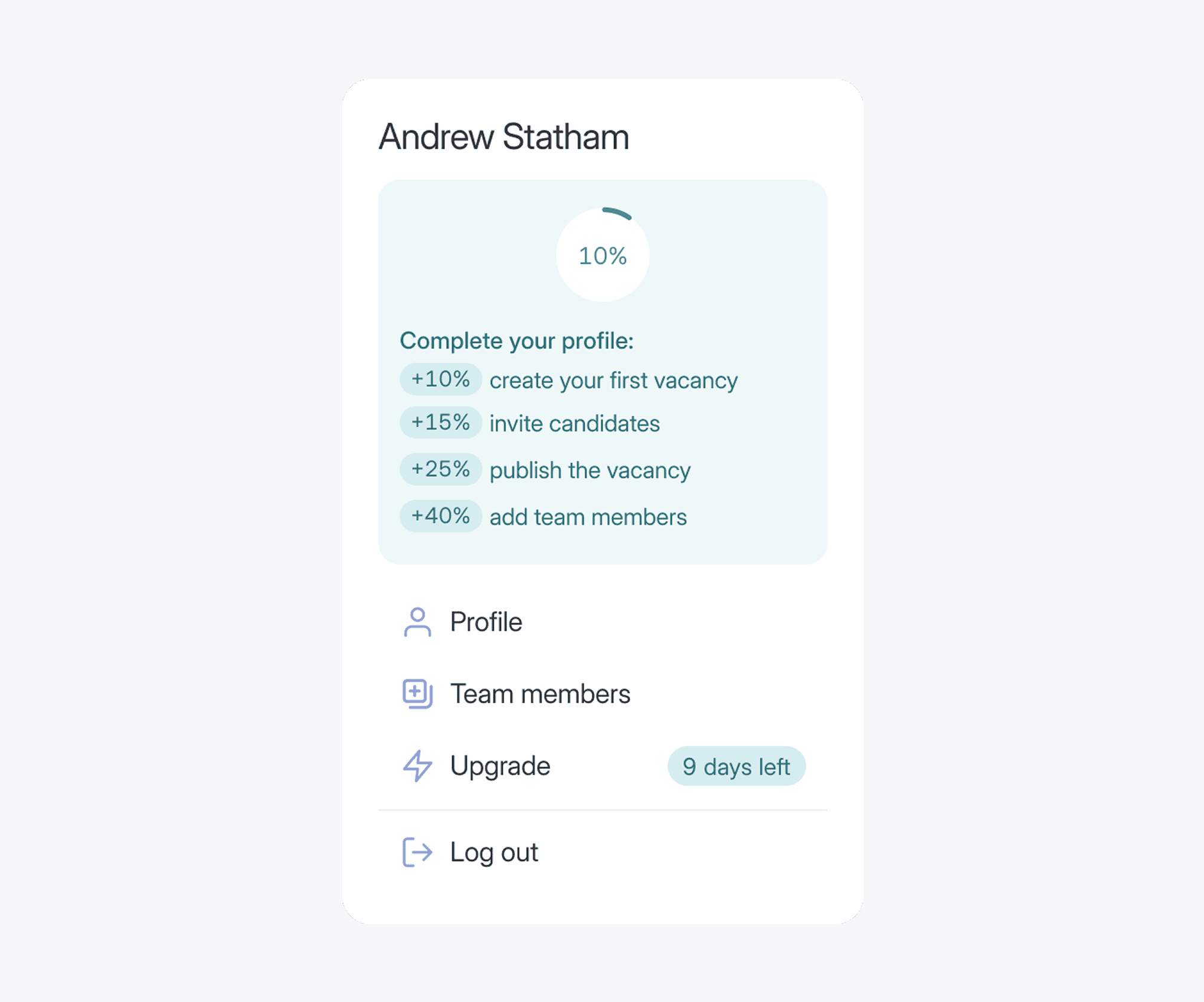
A side panel with weighted steps
Final design
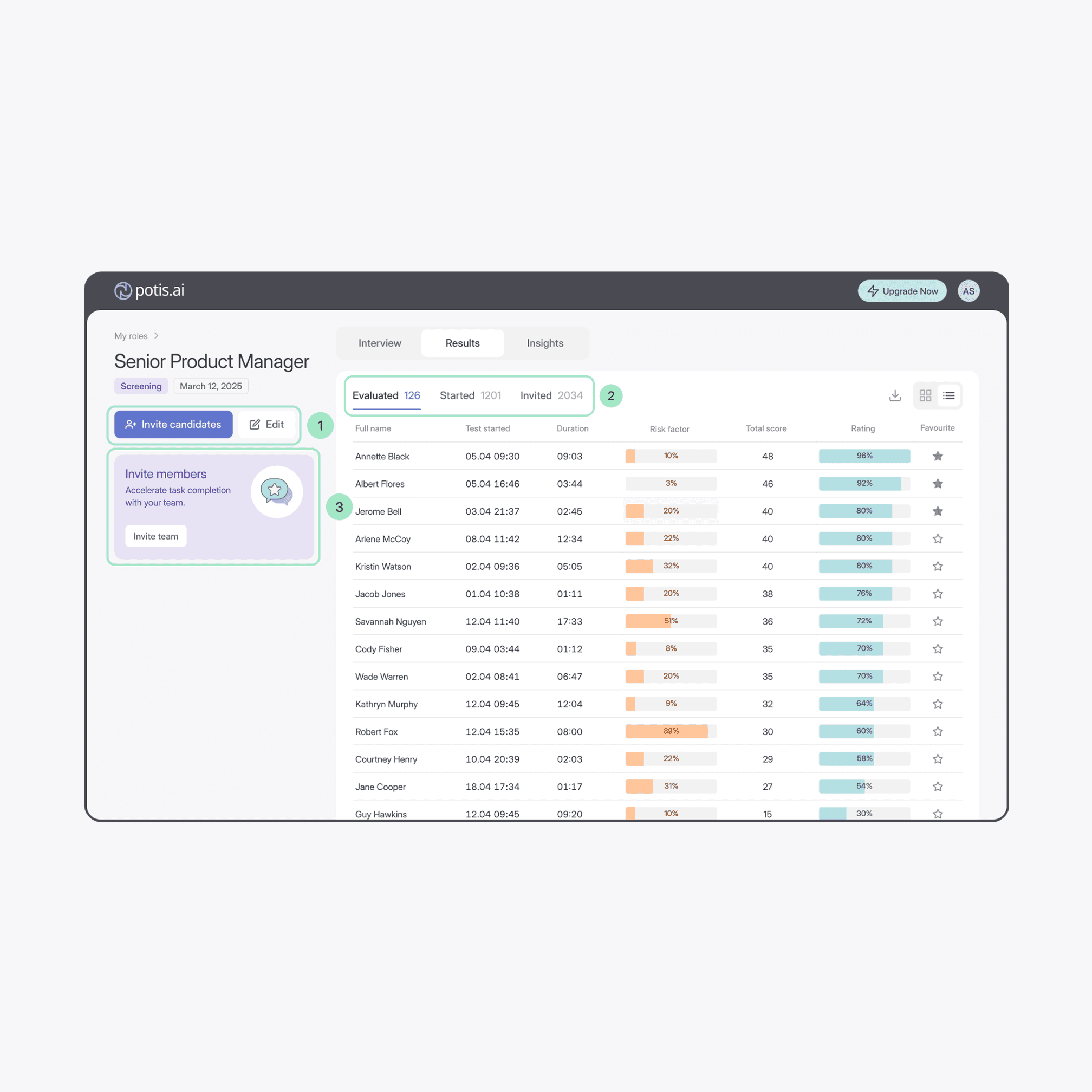
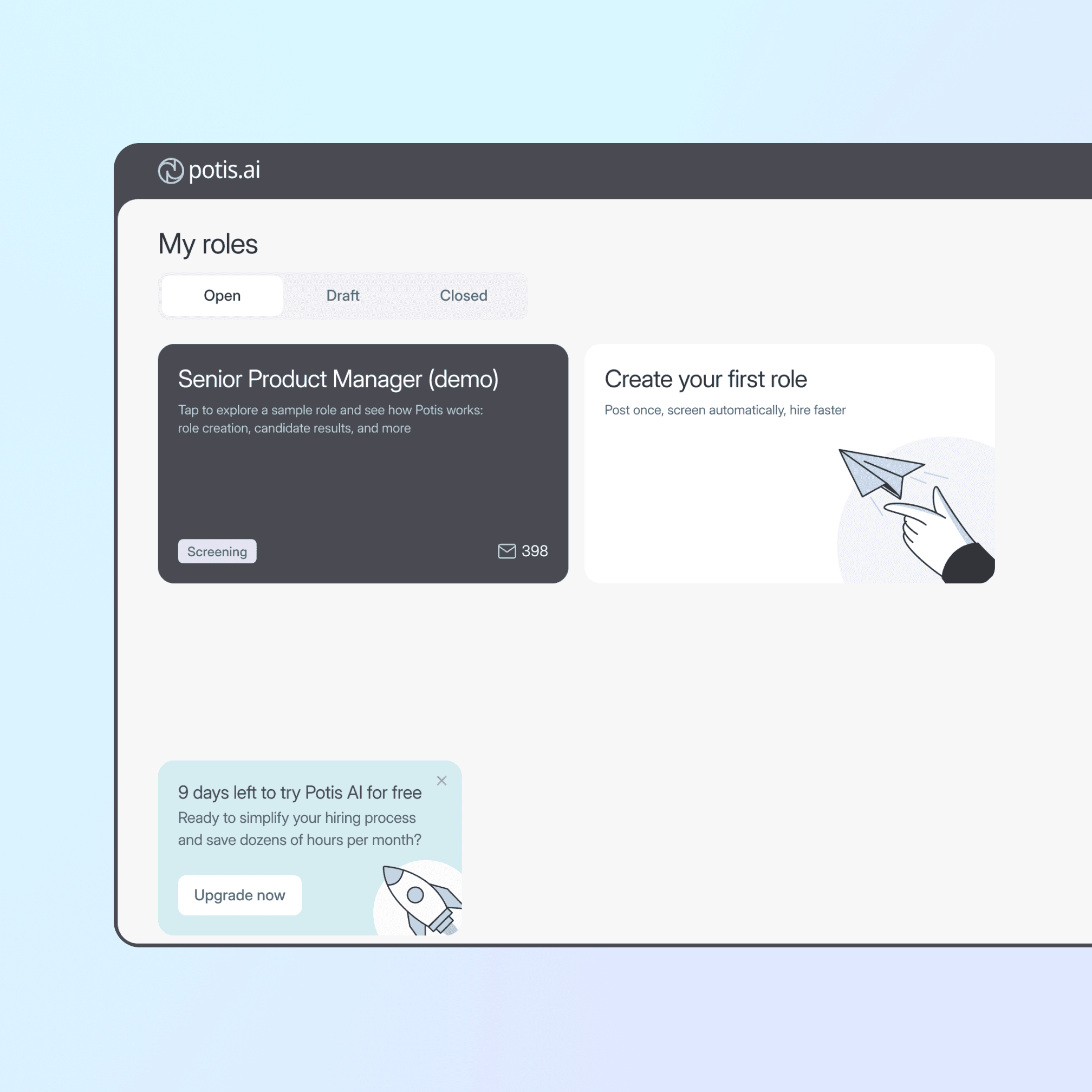
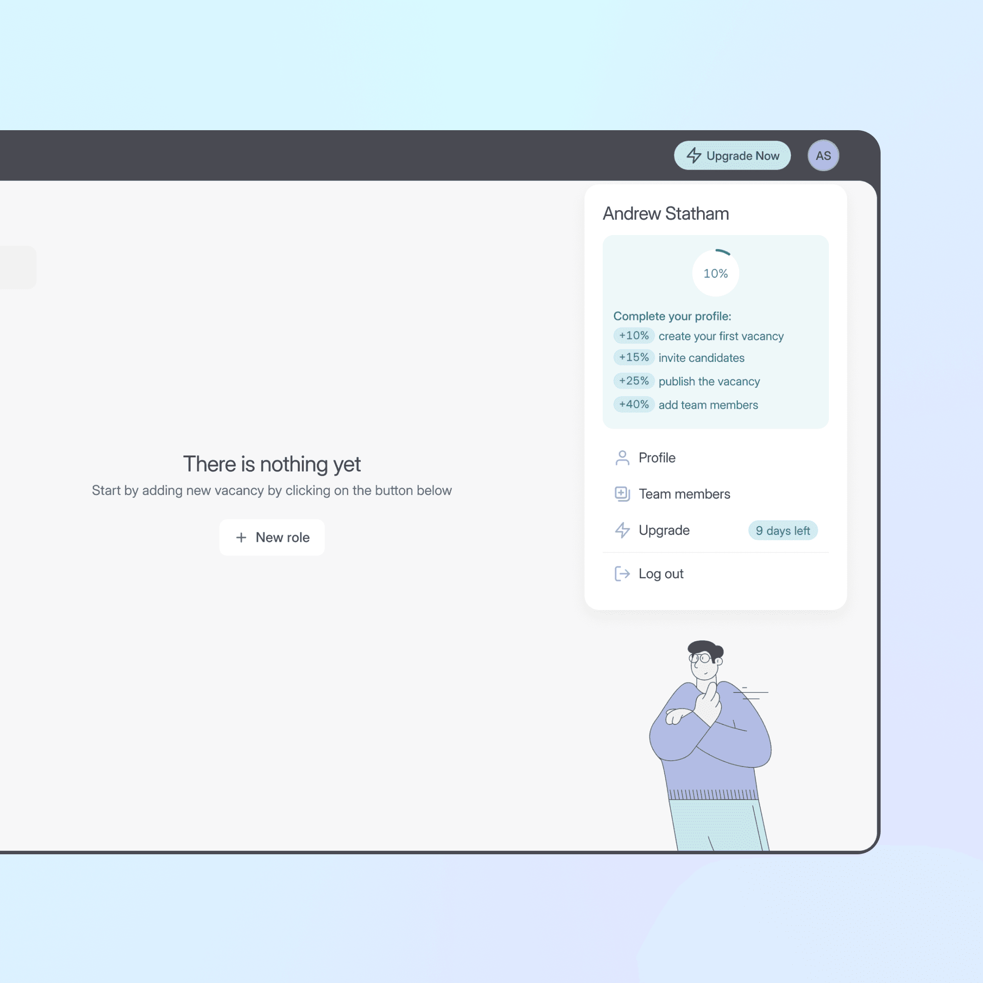
Dashboard: First Value & Activation
The redesigned dashboard meets users at every stage:
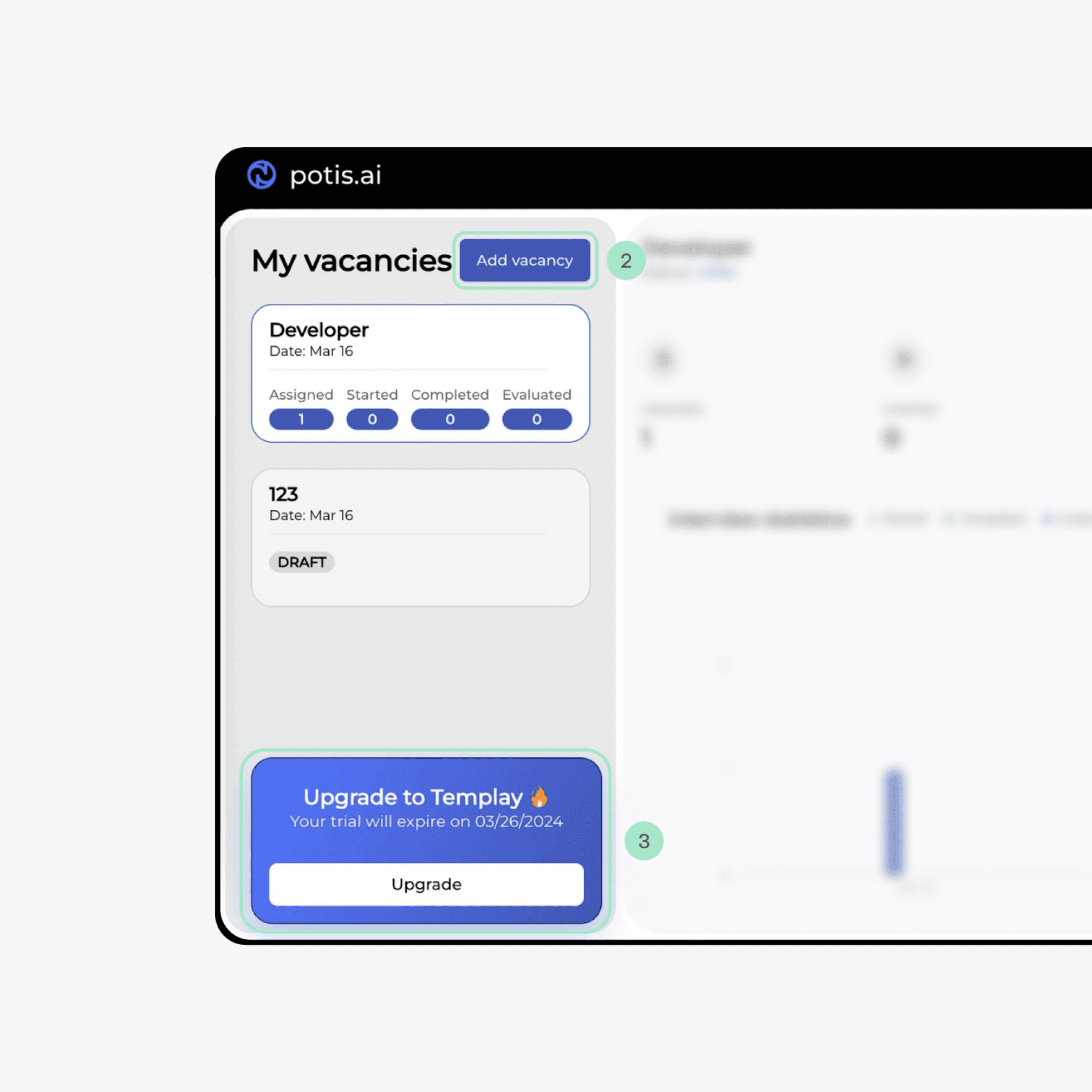
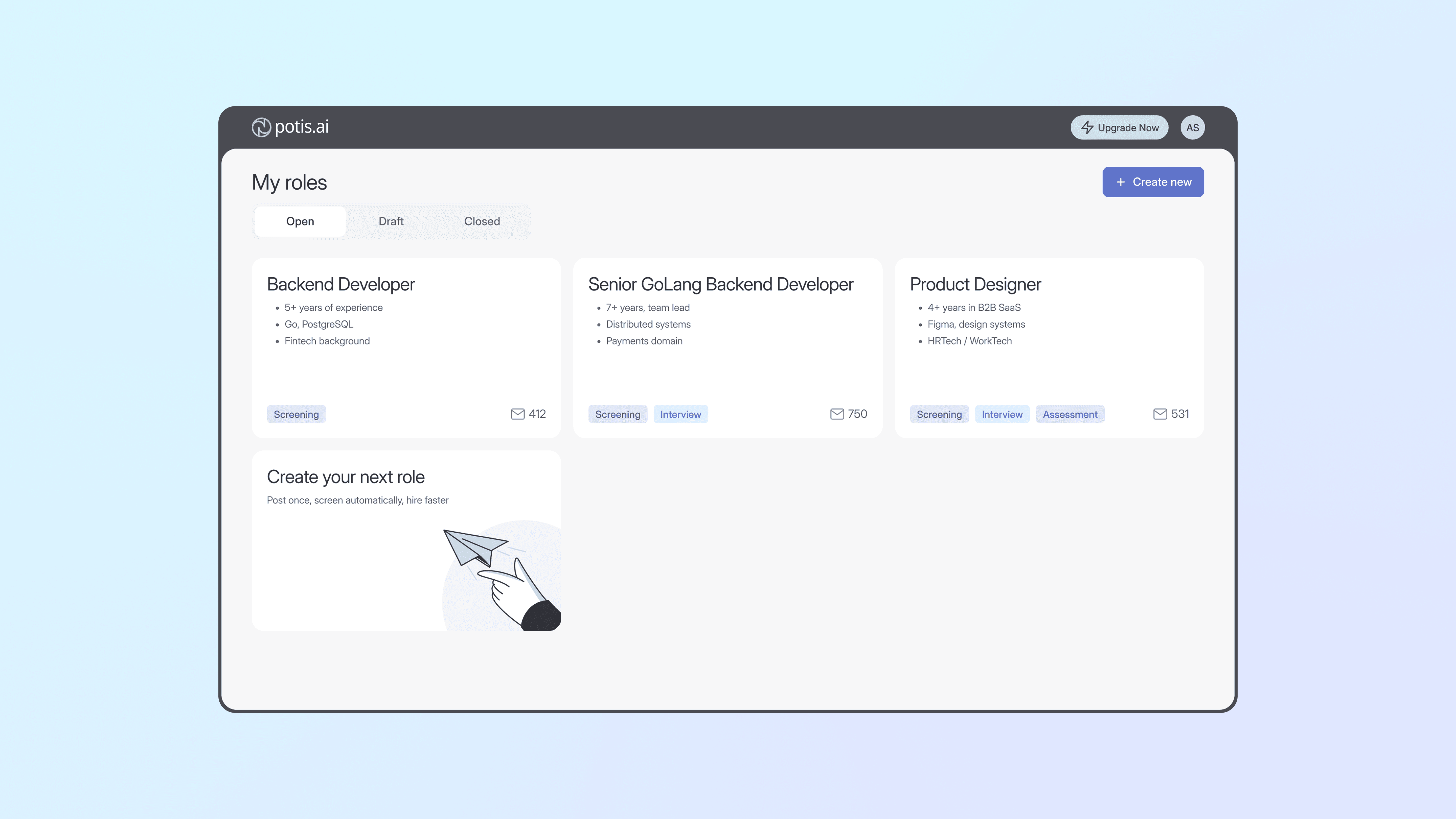
Active state — roles scale into a clean, scannable grid with status tags, "Create new" always in reach.
First session — a pre-filled demo role to explore, with "Create your first role" as the clear next step.
Empty state — an encouraging prompt and profile checklist guide users to their first action, not a dead end.
Role overview
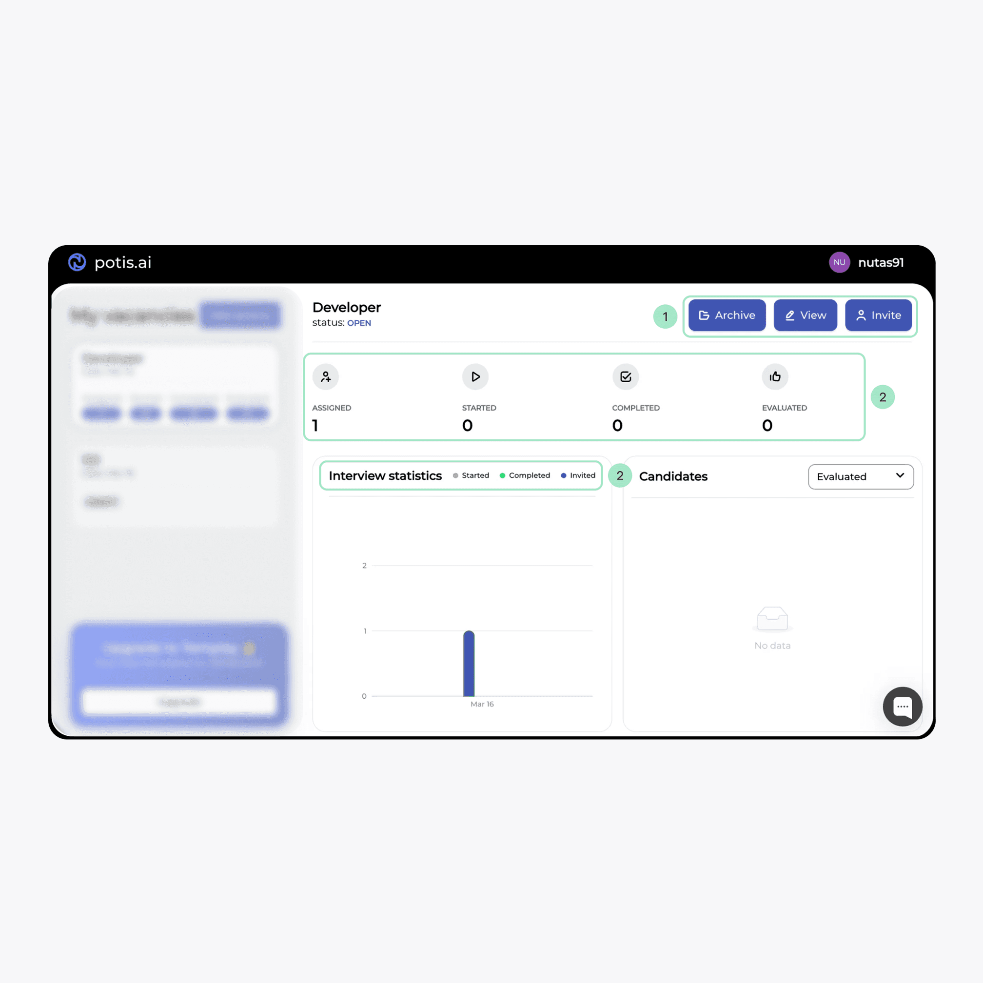
The layout splits into two areas: a left panel keeps key actions and team prompts always within reach, while the main area stays focused on role content without competing for attention.

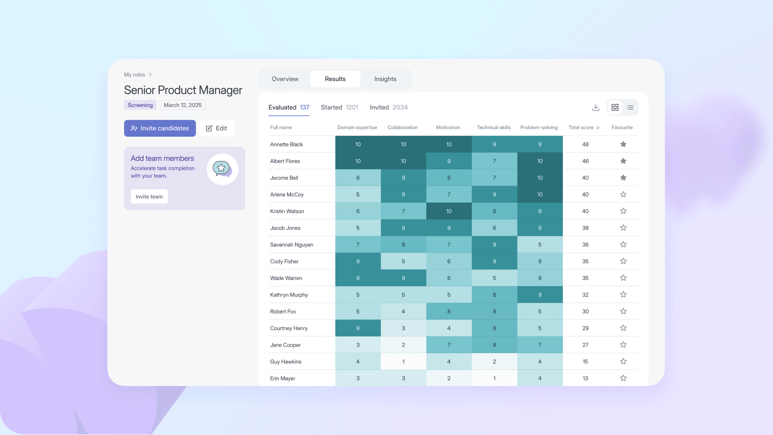
Role results
Results are shown in two views: a table for detailed review and a heatmap for fast comparison. Color intensity reflects skill proficiency, enabling quick identification of strengths and gaps.
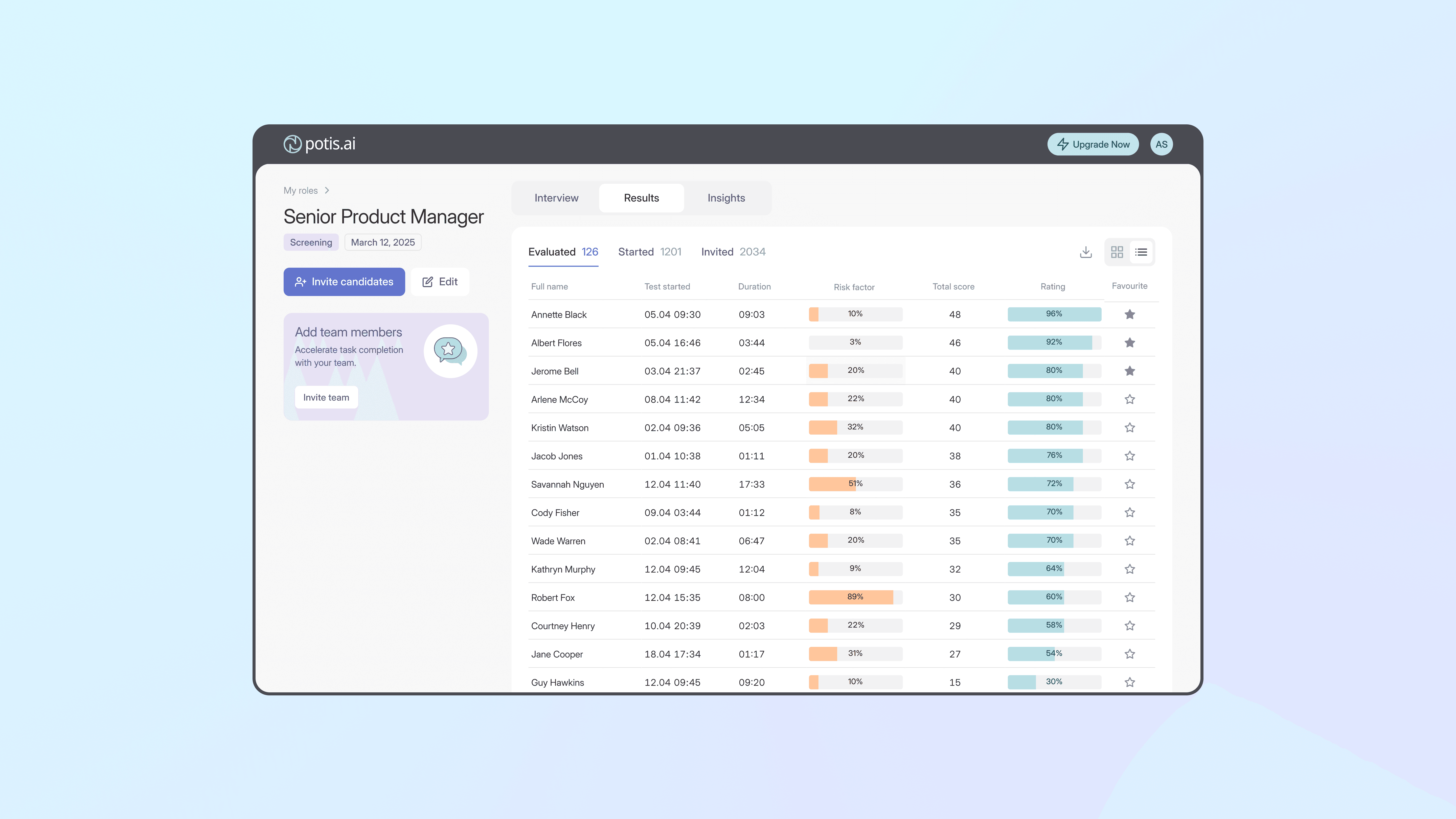

Role results — "Started" view


