Restructuring
the transaction model
to scale financial planning
5% → 18%
Planned transaction adoption
Transactions created as Planned
Transactions created as Planned
80% → 92%
80% → 92%
Completion rate
Completion rate
72% → 95%
Transactions with a category
Transactions with a category

Domain
B2B2C
FinTech
Mobile app
B2B2C, FinTech, Mobile app
Users
Microbusiness owners
Sole proprietors
Freelancers
Microbusiness owners, Sole proprietors, Freelancers
Team
Product Manager
Tech Lead
Backend & Frontend Developers
Quality Assurance Specialist
Senior Product Designer (me)
Product Manager, Tech Lead, Backend & Frontend Developers, QA, Senior Product Designer (me)
What I did
User research
Product analytics
Information architecture
Interaction design
UI design & Design system
Research, Product analytics, Information architecture, Interaction design, UI design and Design system
Product
Kimi is a financial accounting app for microbusiness owners. While most bank
transactions are imported automatically, users still manually record cash expenses,
contractor payments, and transfers.
Kimi is a financial accounting app for microbusiness owners. While most bank transactions are imported
automatically, users still manually record cash expenses, contractor payments, and transfers. These manual entries directly determine the quality of reports, budgets, and forecasts.
These manual entries directly determine the quality
of reports, budgets, and forecasts.
Context
The goal was to evolve the product from an expense tracking app into a financial planning tool. The next roadmap milestone was Recurring Transactions, it is a feature
enabling users to plan regular expenses and improve cash-flow forecasting.
The goal was to evolve the product from an expense
tracking app into a financial planning tool. The next roadmap milestone was Recurring Transactions,
it is a feature enabling users to plan regular expenses and improve cash-flow forecasting.
The goal was to evolve the product from an expense tracking app into a financial planning tool. The next
roadmap milestone was Recurring Transactions, it is a feature enabling users to plan regular expenses
and improve cash-flow forecasting.
Before launching the new functionality, it was important to understand whether the existing transaction creation model could scale without increasing complexity for users.
However, before launching the new functionality, it was important to understand whether the existing
transaction creation model could scale without increasing complexity.
Before launching the new functionality, it was important
to understand whether the existing transaction creation model
could scale without increasing complexity for users.

Old interface

The mental model behind
Research
I conducted the research in 2 phases:
Quantitative: I partnered with the PM to analyze the transaction funnel and user
behavior across Actual and Planned transactions.Qualitative: I conducted usability tests, interviews, a design audit, and competitor
analysis to explain the observed behavior
Quantitative: I partnered with the PM to analyze
the transaction funnel and user behavior across Actual and Planned transactions.Qualitative: I conducted usability tests, interviews,
a design audit, and competitor analysis to explain
the observed behavior
Quantitative: I partnered with the PM to analyze the transaction funnel and user behavior across
Actual and Planned transactions.Qualitative: I conducted usability tests, interviews, a design audit, and competitor analysis to explain
the observed behavior
Key findings from research:
1. One in five transactions was abandoned
The completion rate was only 80%, leaving gaps in users’ financial data
The completion rate was only 80%, leaving
gaps in users’ financial data.
2. Planned transactions weren’t adopted
Adoption remained at 5%, indicating users weren’t moving from expense tracking to financial planning
Adoption remained at 5%, indicating users
weren’t moving from expense tracking
to financial planning
3. Users didn’t understand “Planned transactions”
8/10 participants expected planning to be part of transaction creation rather than a separate mode
8/10 participants expected planning to be part
of transaction creation rather than a separate mode.
4. The architecture mixed independent concepts
It combined transaction type,
timing, and navigation into a single decision, making the interface difficult to understand and extend
It combined transaction type, timing, navigation into a single decision, making
the interface difficult to understand and extend
It combined transaction type, timing,
navigation into a single decision, making the interface difficult to understand and extend
Overview
Overview
Key Insight
The research revealed that the issue wasn’t the Planned feature itself —
it was the interaction model. Users naturally answered two questions in sequence:
The research revealed that the issue wasn’t
the Planned feature itself — it was the interaction model. Users naturally answered two questions in sequence:
The research revealed that the issue wasn’t the Planned feature itself — it was the interaction model.
Users naturally answered two questions in sequence:
- What kind of transaction is this?
- When does it happen?
The interface forced users to decide both in one step.
But users think sequentially — they know what the transaction was before they know when it happened.
The interface forced users to answer both at the same time, making Planned feel like an alternative mode rather than a transaction property.


Design Principle
Instead of treating “Planned” as just another mode,
I proposed redefining the transaction model.
Instead of treating “Planned” as just another mode, I proposed redefining
the transaction model.
Instead of treating “Planned” as just another mode, I proposed
redefining the transaction model.
Every transaction answers two questions:
What kind of transaction is this? — Expense / Income / Transfer
What kind of transaction is this? — Expense / Income / Transfer
When does it happen? — Actual / Planned
When does it happen?
— Actual / Planned
Separating type and time allowed us to maintain a unified creation flow, making planning a natural part of it. This model also enabled recurring payments to be added without redesigning the transaction creation flow.
Separating type and time allowed us to maintain
a unified creation flow, making planning a natural part of it. This model also enabled recurring payments to be added without redesigning the transaction creation flow.
Separating type and time allowed us to maintain a unified creation flow, making planning a natural part
of it. The model also enabled recurring payments to be added without redesigning the transaction creation.

Design validation
Before release, I validated the new flow through usability testing.
Before release, I validated the new flow through
usability testing.
- After the redesign, 9 out of 10 participants were able
to explain when to use “Actual” and when to use “Planned.”
- All participants completed the scenario without prompts.
- After the redesign, 9 out of 10 participants were able to explain when to use “Actual” and when to use “Planned.”
- All participants completed the scenario without prompts.
After the test, I asked the Single Ease Question — “How easy was it to create
a transaction?” And the average rating was 6.3 out of 7.
After the test, I asked the Single Ease Question — “How easy was it to create a transaction?”
And the average rating was 6.3 out of 7.
Final Design
The redesigned flow reduces friction by keeping users on a single screen. Amount entry, transaction details, and confirmation happen in one continuous experience.
The redesigned flow reduces friction by keeping
users on a single screen. Amount entry, transaction details, and confirmation happen in one continuous experience.
The redesigned flow reduces friction by keeping users on a single screen. Amount entry, transaction
details, and confirmation happen in one continuous experience.
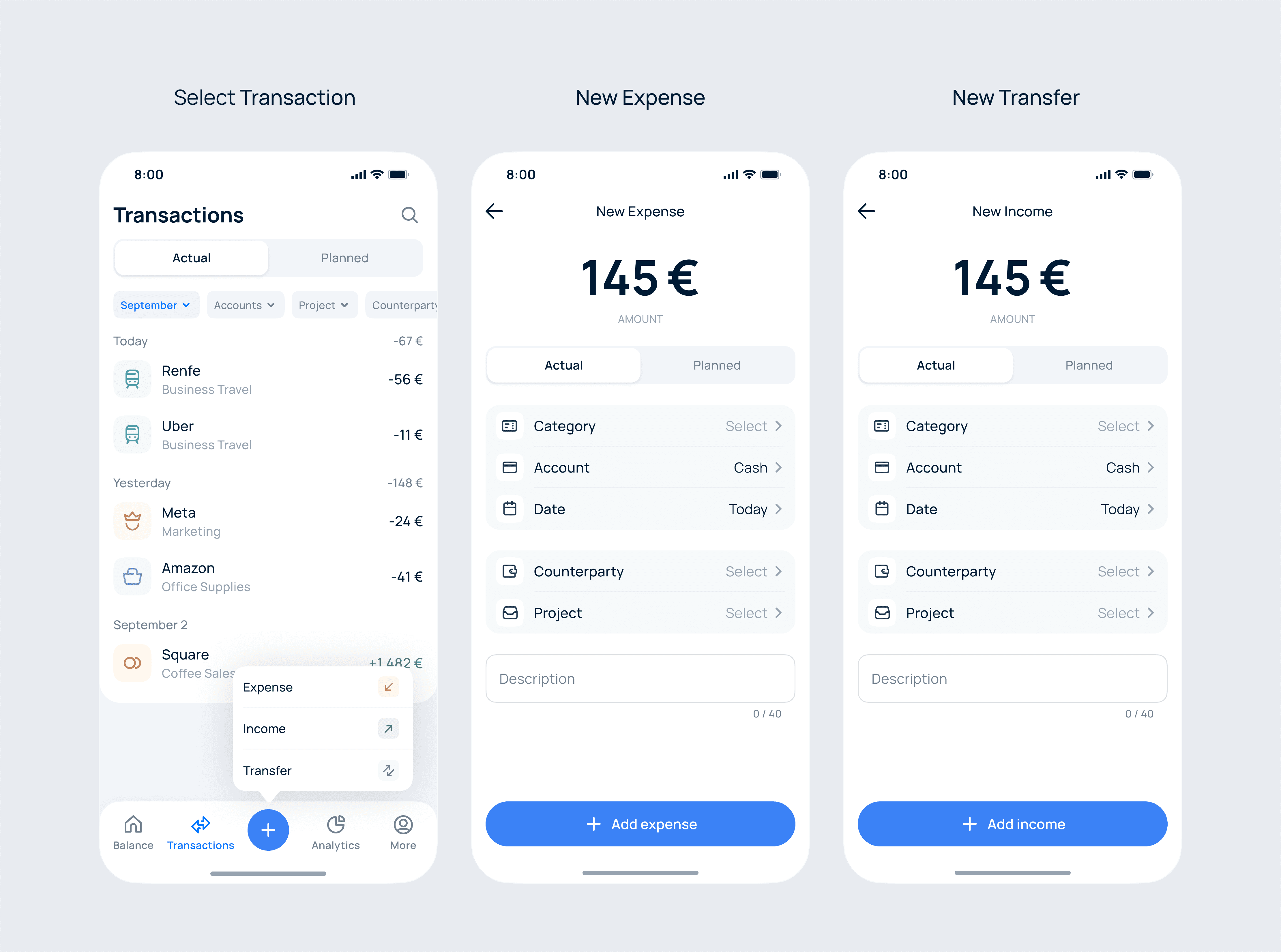
Transaction creation flow
Users enter the amount, optionally adjust transaction details, and save. Default
values for account and date reduce manual input, while the new transaction
is immediately reflected in the list with a confirmation message.
Users enter the amount, optionally adjust transaction details, and save. Default values for account and date
reduce manual input, while the new transaction
is immediately reflected in the list with a confirmation message.
Users enter the amount, optionally adjust transaction details, and save. Default values for account
and date reduce manual input, while the new transaction is immediately reflected in the list
with a confirmation message.


Add new expense
Expense / Income / Transfer
I intentionally kept the data entry forms consistent. The visual differentiation happens at the decision point — choosing the transaction type, while the form remains
familiar to reduce cognitive load and support faster repeated entry.
I intentionally kept the data entry forms consistent.
The visual differentiation happens at the decision point — choosing the transaction type, while the form remains familiar to reduce cognitive load and support faster repeated entry.
I intentionally kept the data entry forms consistent. The visual differentiation happens at the decision
point — choosing the transaction type, while the form remains familiar to reduce cognitive load and support faster repeated entry.

Transfer flow
Transfer flow simplifies moving money between personal accounts. Users enter the amount, select the source and destination accounts, optionally add a date or description, and save. The app automatically updates both balances and records the transfer as a single linked transaction.
Transfer flow simplifies moving money between personal accounts. Users enter the amount, select the source and destination accounts, optionally add a date or description, and save. The app automatically updates both balances and records the transfer as a single linked transaction.

Add new transfer
Actual vs Planned transactions
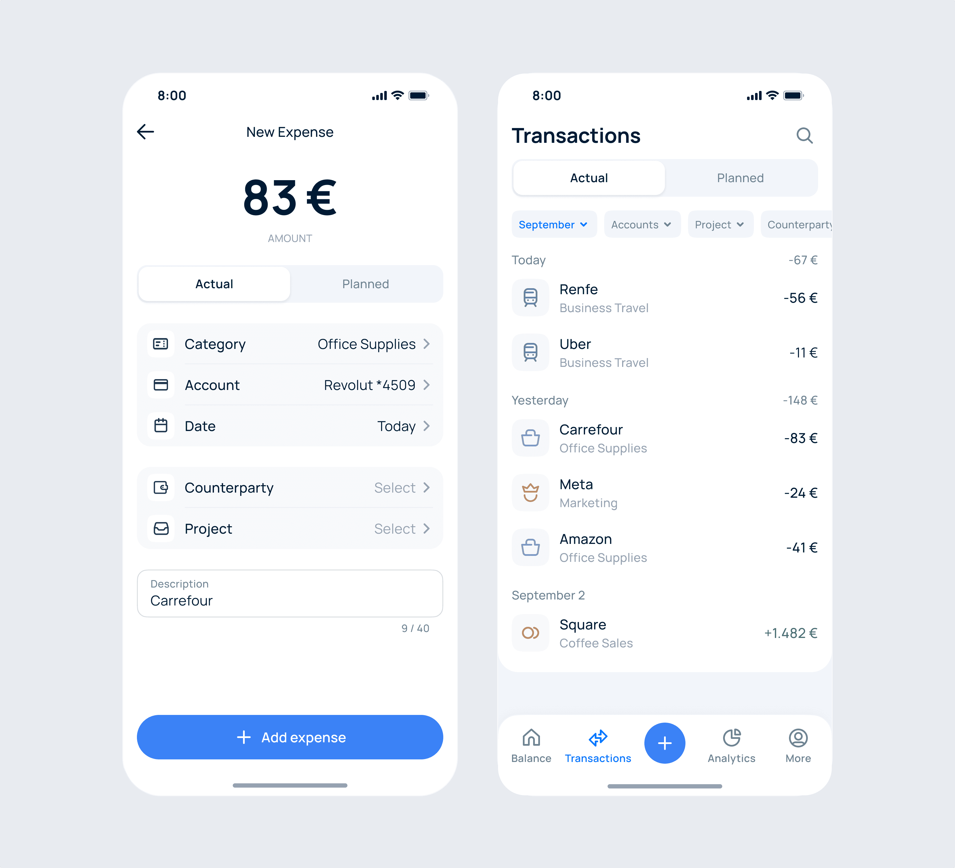
Actual and Planned share the same form. Only the timing changes: an Actual transaction records something that already happened, while a Planned one schedules a future entry that feeds the cash-flow forecast. Keeping the layout identical means users learn the flow once and reuse it for both.
Actual and Planned share the same form. Only the timing changes: an Actual transaction records something that already happened, while a Planned one schedules a future entry that feeds the cash-flow forecast. Keeping the layout identical means users learn the flow once and reuse it for both.
Actual expense
