Cutting wizard drop-off

by 18 points

by 18% points

52% → 34%

52% → 34%

Onboarding drop-off

8 → 5

Task completion flow

4.3 / 5

Customer satisfaction

Domain

B2B
HRTech
AI

B2B, HRTech, AI

Users

Recruiters
Hiring Managers
HRDs
Candidates

Recruiters, Hiring Managers, HRDs
& Candidates

Team

Product Manager
Developers
HR Consultant
BusDev
Founding Product Designer (me)

Product Manager, Developers, HR Consultant, BusDev, Founding Product Designer (me)

What I did

Design audit
User research
Key product design
UX/UI direction
User testing

Design audit, User research, Key product design, UX/UI direction, User testing

Product Context

Potis AI  is an AI startup that helps companies run more structured and fair candidate interviews. I joined as the Founding Product Designer, owning the end-to-end UX 
and partnering with founders to evolve the product from early traction into a scalable platform.

Potis AI  is an AI startup that helps companies run more structured and fair candidate interviews. I joined as the Founding Product Designer, owning the end-to-end UX and partnering with founders to evolve the product from early traction into a scalable platform.

This is the second of two activation cases. Once users saw the product’s value on the dashboard, the next hurdle was acting on it and creating their first role through a multi-step wizard.

Problem

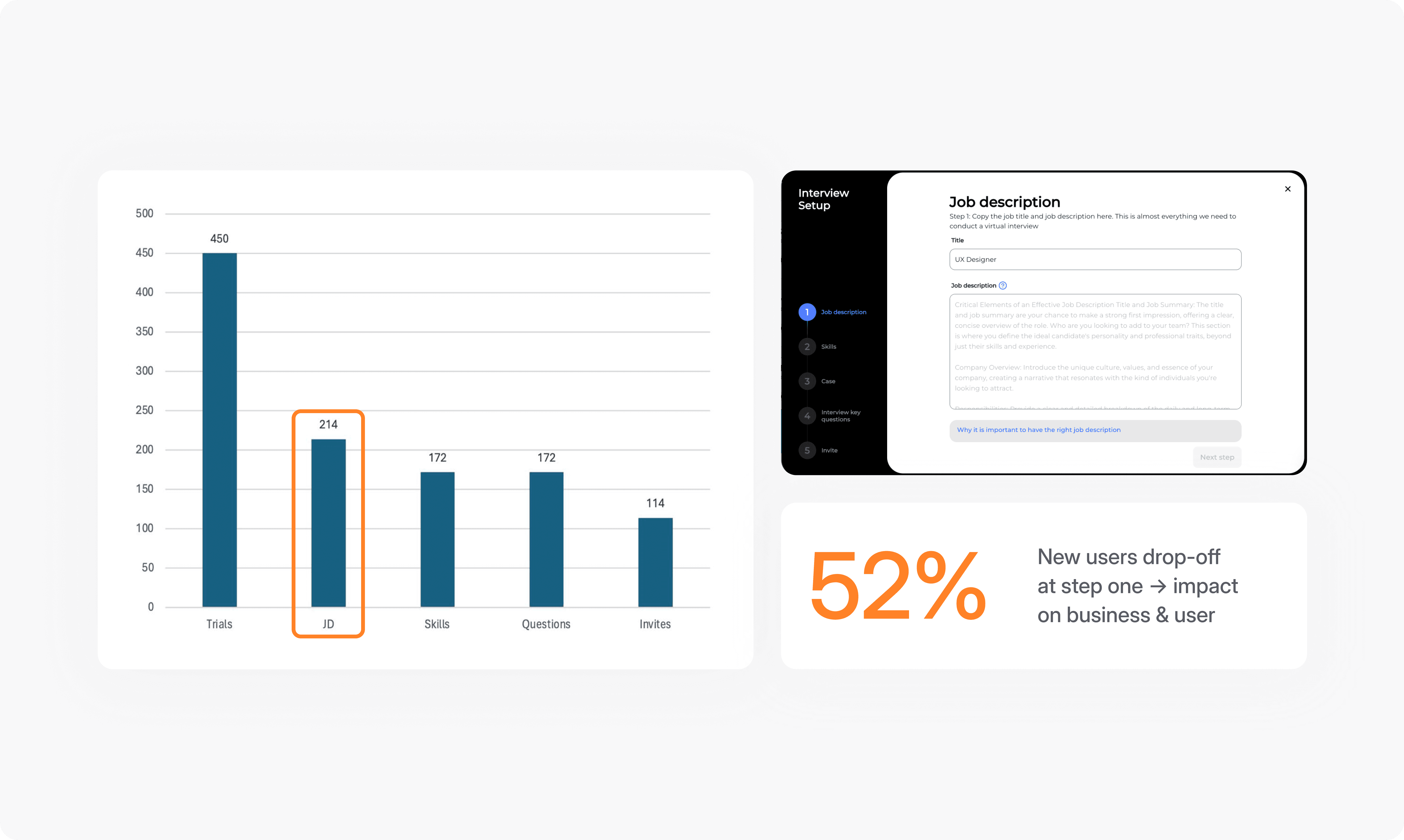
After a high-traffic launch, Potis AI saw a surge of new users.

But over 50% dropped off inside the job-creation wizard,
the multi-step flow they had to complete to post a role.

But over 50% dropped off inside the job-creation wizard, the multi-step flow they had to complete to post their role.

Entry into the wizard was the worst point, but friction ran across the whole sequence. With users arriving faster than they were converting, closing this gap was the highest-leverage problem in front of me.
Research

To find the causes of the drop-off, I combined qualitative and quantitative research:

  • Interviewed 5 users to understand how they approached creating a role.

  • Instrumented an Exit Intent popup on the problem step myself, to capture why users were leaving in the moment.

  • Interviewed 5 users to understand how they approached creating a role.

  • Added an Exit Intent popup on the problem step myself, to capture why users were leaving.

  • Interviewed 5 users to understand how they approached creating a role.

  • Added an Exit Intent popup on the problem step myself,
    to capture why users were leaving in the moment.

Key insight: creating a role took heavy manual entry.
Coming from an AI product, users especially expected it to do more of the work for them.

Key insight: creating a role took heavy manual entry.
Coming from an AI product, users especially expected it to do more
of the work for them.

Key insight: creating a role took heavy manual entry. Coming from an AI product, users especially expected it to do more
of the work for them.

Overview

Overview

Hypothesis

If manual input was the blocker, removing it was where I started.

If we automate the role input, users get through the first step faster — increasing conversion to the next stage and shortening the path to completion.

If we automate the role input, users get through the first step without writing it manually — increasing conversion to the next stage and shortening the path to the final screen.

First iteration

Removing friction, building confidence

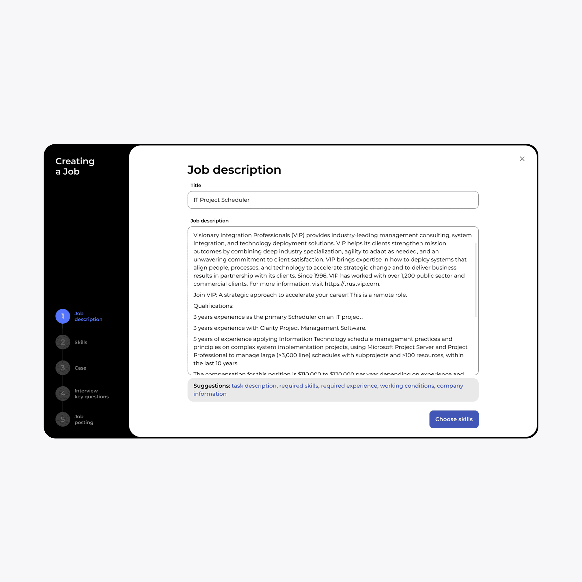
I focused on lowering the barrier to entry: instead of a blank wizard, users now start from an AI-generated draft. I added Write with AI to generate the job description, inline examples to guide input, and tighter UX copy to reduce hesitation.

The shift wasn't "added AI", but it was moving users from a blank screen to a draft they only had to refine.
Before

After

Design validation

I validated the direction through usability tests, then shipped. Conversion lifted 5%, then 7%. It was an early signal we were solving the right problem, and the cue to push further down the funnel.

Second iteration

Step-one drop-off was the symptom, not the goal. Optimizing one screen would have capped the win, so I ran a detailed UX audit of the full wizard and presented it
to the team, which set the direction for the next iteration.

Step-one drop-off was the symptom, not the goal. Optimizing one screen would have capped the win, so I ran a detailed UX audit of the full wizard and presented it to the team, which set the direction for the next iteration.

Step-one drop-off was the symptom, not the goal. Optimizing one screen would have capped the win, so I ran
a detailed UX audit of the full wizard and presented it
to the team, which set the direction for the next iteration.

The friction split into two buckets: technical and UX/UI, and later reframed hypothesis around the whole journey.

UX audit of the wizard

UX audit of the wizard

If we streamline

the setup by reducing steps and fixing UI friction, users will reach the "Invite" stage faster, significantly increasing conversion to the invite candidates step.

If we streamline

the setup by reducing steps and fixing UI friction, users will reach the "Invite" stage faster, significantly increasing conversion to the invite candidates step.

Step 2 — Skills

I rebuilt the cards for inline editing so users could adjust skills without friction, smoothed the flow for adding a new skill, and removed redundant actions.

I rebuilt the cards for inline editing so users could adjust skills without friction, smoothed the flow for adding a new skill, and removed redundant actions.

Before

After

Step 3 — Cases

Users wanted options, not a single fixed output. I added AI regeneration so they could choose between case variants, and flexible inline editing.

Users wanted options, not a single fixed output. I added AI regeneration so they could choose between case variants, and flexible inline editing.

Before

After

Final Design

Results & Impact

We had a few major iterations, where I improved the UI across the following steps — removing unnecessary actions and adding AI support where it created real value.

As a result, within 3 months of launch, results showed clear improvements:

Within three months of rollout, results showed clear improvements:

52% → 34%

52% → 34%

Drop-off at the first step decreased

Drop-off at the first step decreased

8 → 5

A shorter path to complete a role-creation task

A shorter path to complete
a role-creation task

A shorter path to complete a role-creation task

4.3 / 5

Users rated
the redesigned flow

Users rated the redesigned flow

Users rated the redesigned flow

Lesson learned

Once again, it became clear to me that small, targeted improvements at critical points can have an enormous impact, especially when they make the experience feel effortless from the start.

Once again, it became clear to me that small, targeted improvements at critical points can have an enormous impact, especially when they make the experience feel effortless from the start.

next / Scaling VMS for operational complexity

next / Scaling VMS
for operational complexity

ana sushok © 2026